Lydia Blundell
lydiablundell@outlook.com
07794489910
About me
Creative copywriter
I've been a professional copywriter for three years, and an avid writer for much longer. The thrill of landing on the perfect message makes the endless tweaking and redrafting well worth it. I love working with designers and other creatives and have a developed understanding of the strategies behind the copy I produce.
Education
2019
Bachelor of Arts in Ancient History: 2:1
Durham University
2020
Master of Arts in Broadcast Journalism: Distinction
City University, London
Experience
2020-2021
Copy & content writer: Lorfords Antiques
2021-2023
Copywriter: Neptune Home
Print advertising
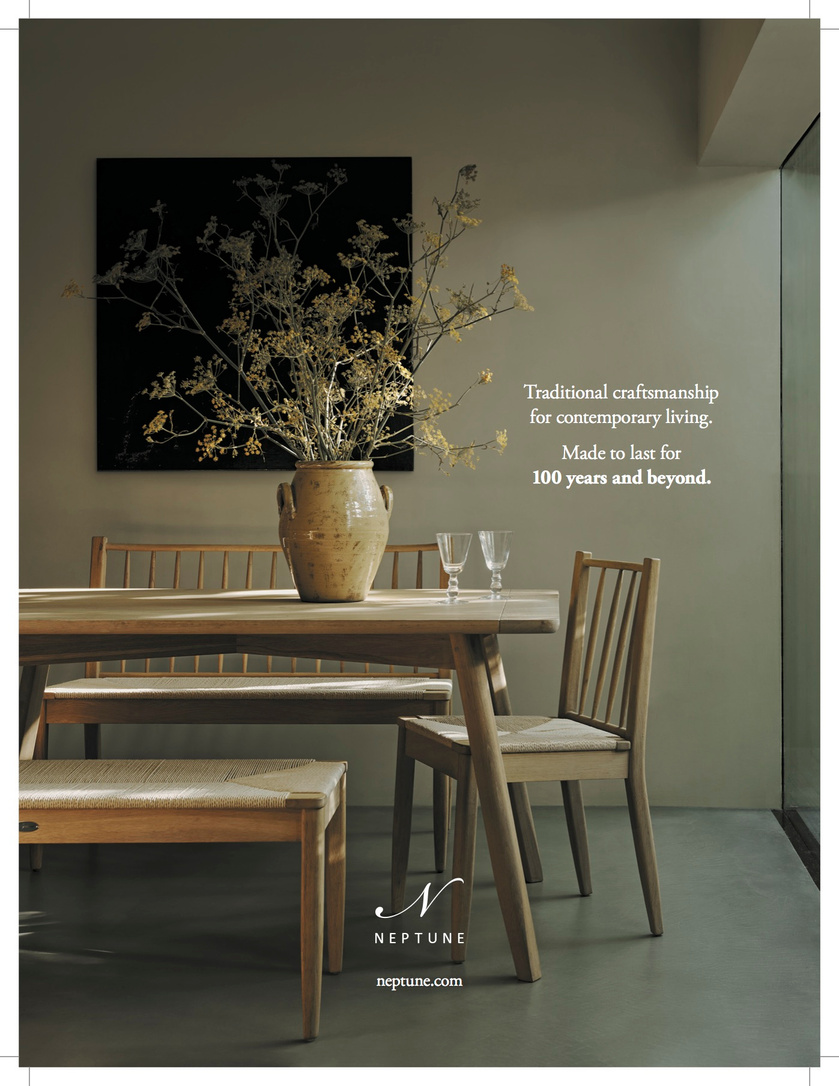
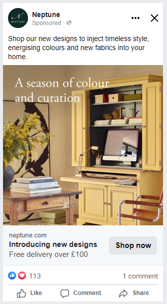
I was tasked with reflecting our 'Why Neptune?' campaign in print adverts. Rather than relying on beautiful imagery, this AD directly addresses why you would pay for a Neptune kitchen over one from a competitor.
neptune.com/kitchen
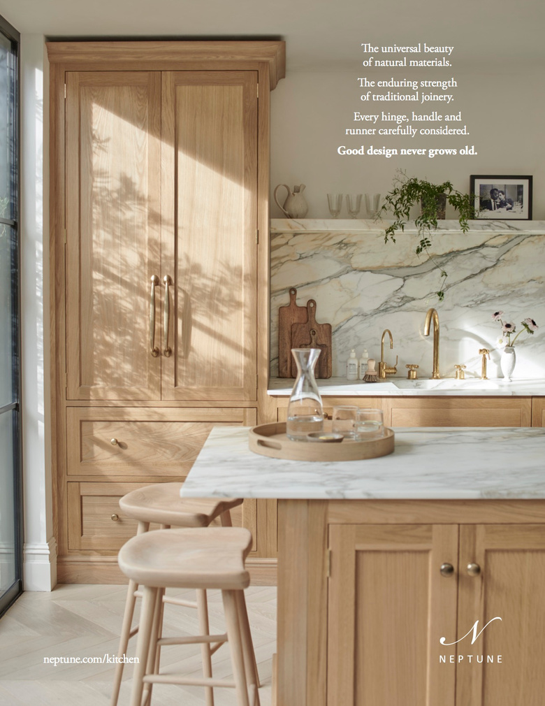

This was the first mention of Neptune's 100-year mission in print advertising.
It reflects an approach that's forward-thinking yet informed by the past, while its short nature ensures the second sentence hits home.
I worked closely with our design lead, experimenting with different typography approaches until we decided on this spacing and the inclusion of bold type.
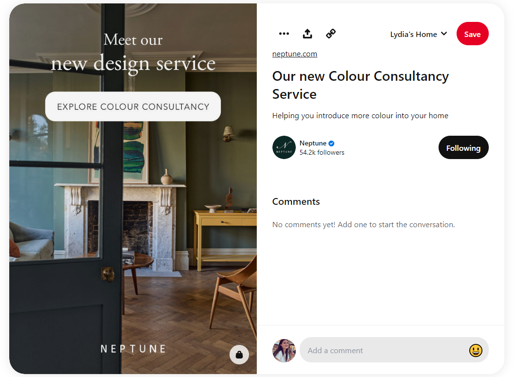
A short and sweet advert to create intrigue around our colour consultancy launch. We ended up using the 'Discover your home's potential' line throughout this campaign.
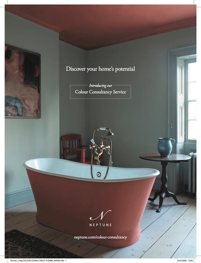
Discover your home’s potential
Introducing our
Colour Consultancy Service
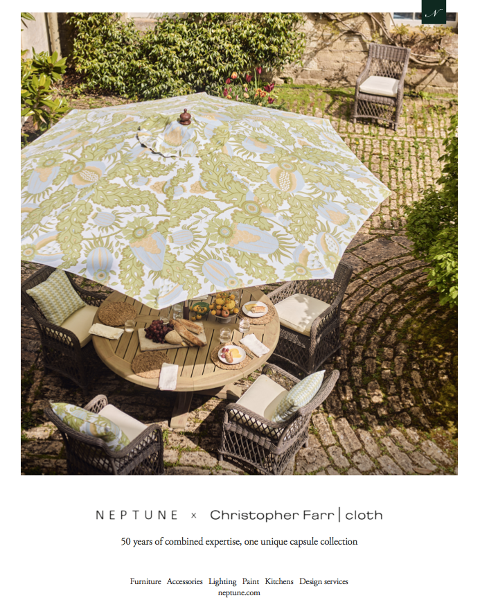
We chose the launch of a new brand collaboration as the moment to launch a new print AD format, too. The format required a very short line, and it needed to do two things: convey the weight of expertise behind both brands, and hint at the scope and exclusivity of the designs involved. I found out that our two combined start dates of 1996 and 2000 made 50 and liked the authority that a specific figure gave the advert.
Landing pages
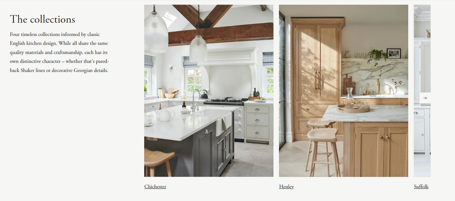
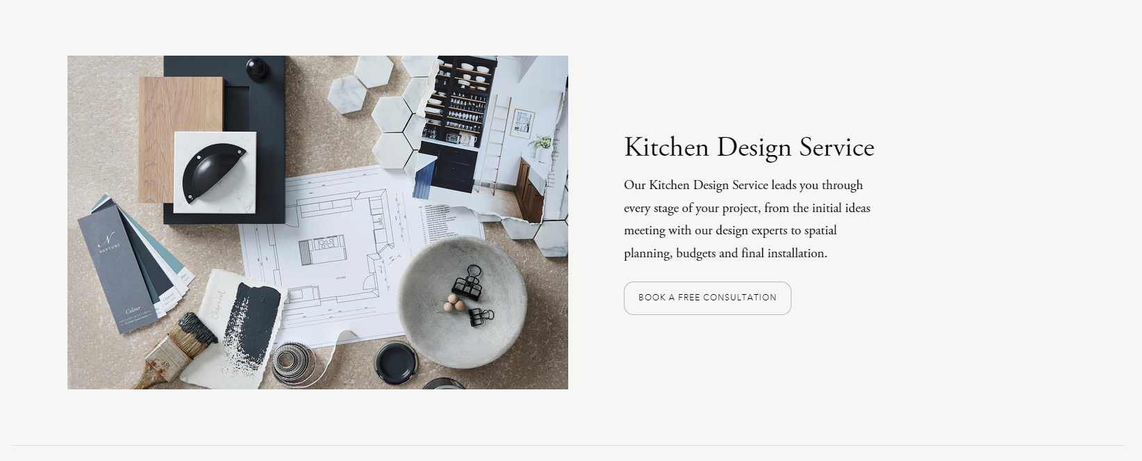
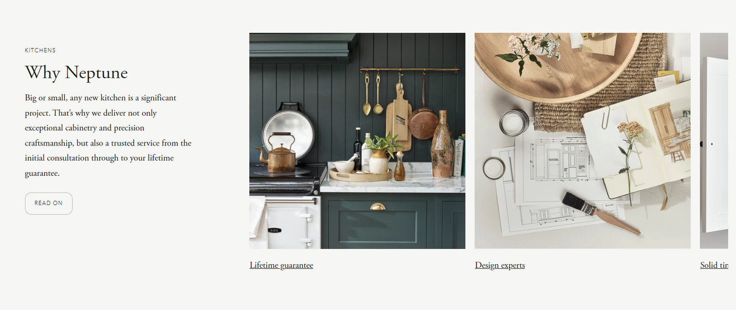
'Why Neptune' brand page to coincide with the launch of our new website. I helped to identify four key pillars of the brand and wrote these up to succinctly convey the company values.
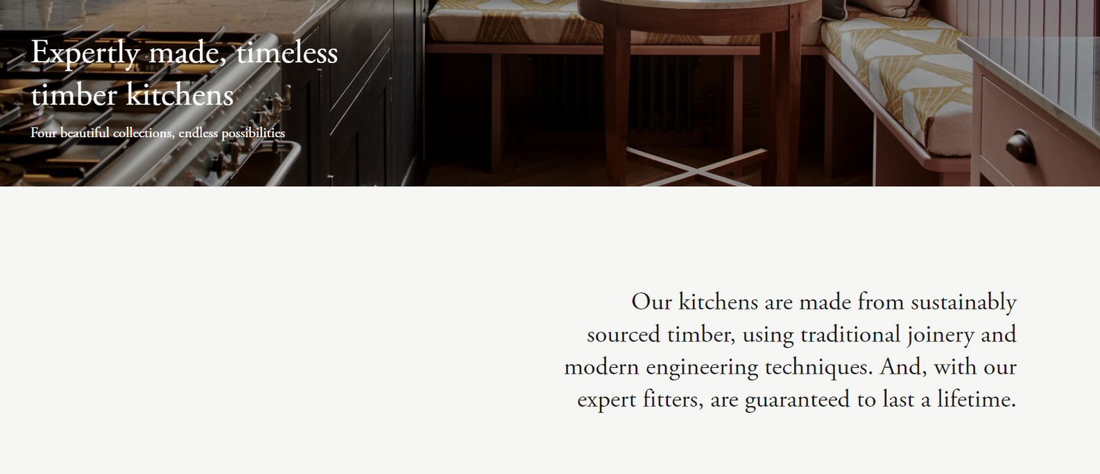
We took the launch of a new website as an opportunity to refine the messaging around our kitchens. As a huge source of income for Neptune, I had to dig deep into our core values and points of difference to make every word count on these landing pages. The journey guides the customer from an overview of our approach to kitchen design through to the different collections and the design service itself. There are frequent calls to action to encourage customers to go straight to the online form for booking an appointment.
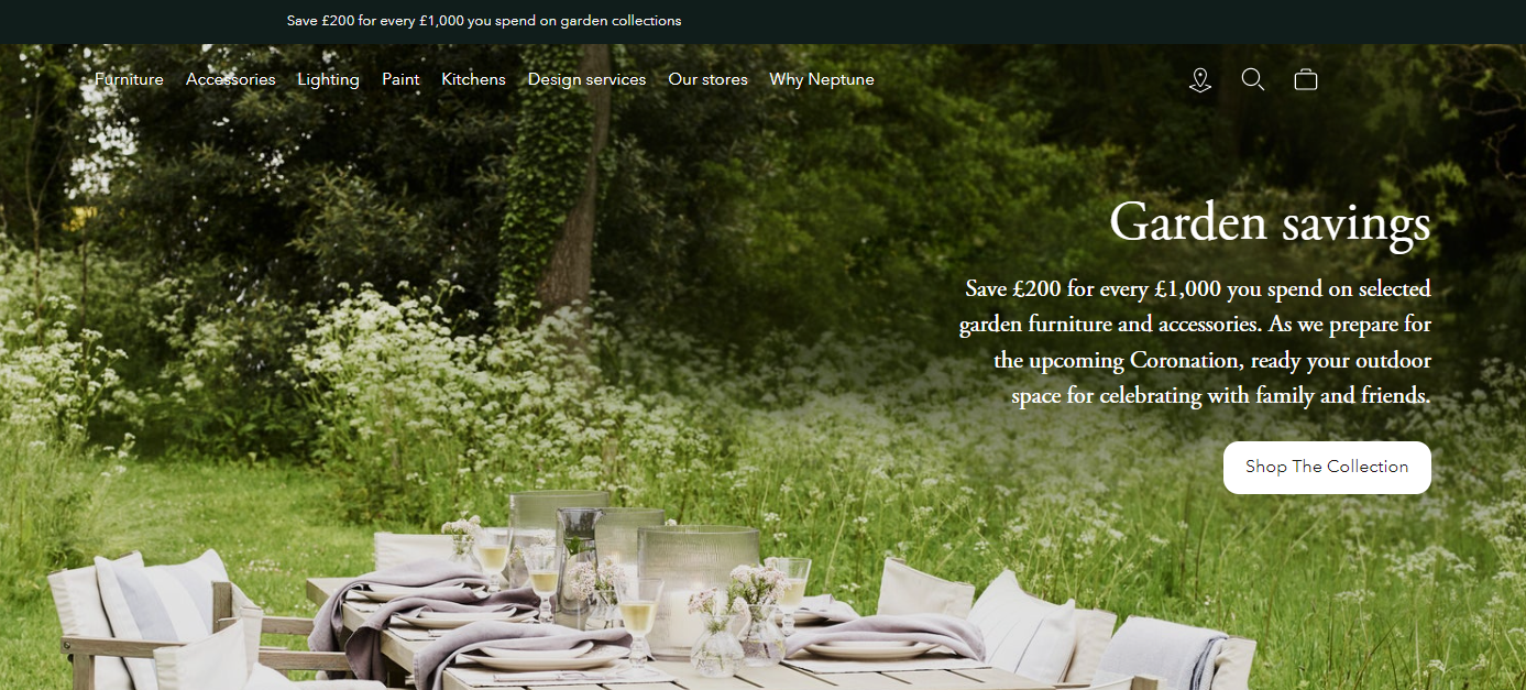
Homepage message and a sitewide banner to draw attention to our garden promotion. In this task, I had to balance the interests of our founders with those of our retail team to provide clear copy that resonates with our brand identity but also encourages sales.
Email marketing
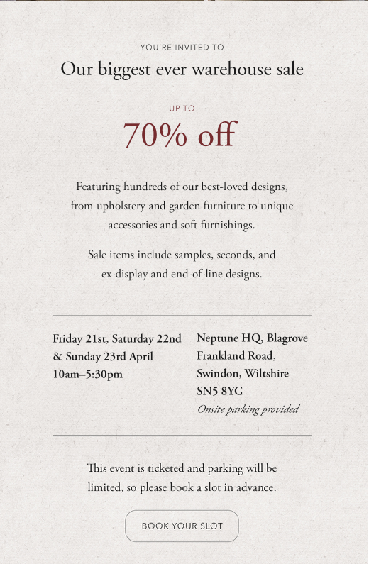
The brief was to make this email feel like a proper invitation.
I liaised closely with our digital designer to work out what we could achieve in the small amount of space.
The key message to get across to our customers was that this was bigger and better than any of the sales they may have experienced before.
We also needed to include the basic facts about the sale without it feeling too granular, before directing them to the Eventbrite page.
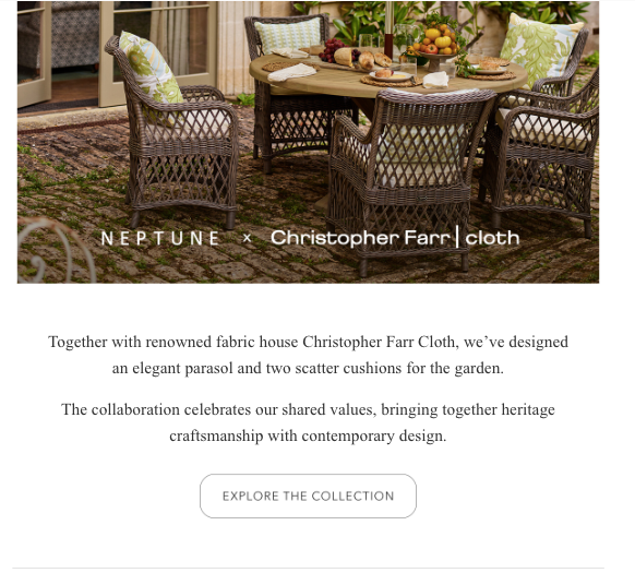
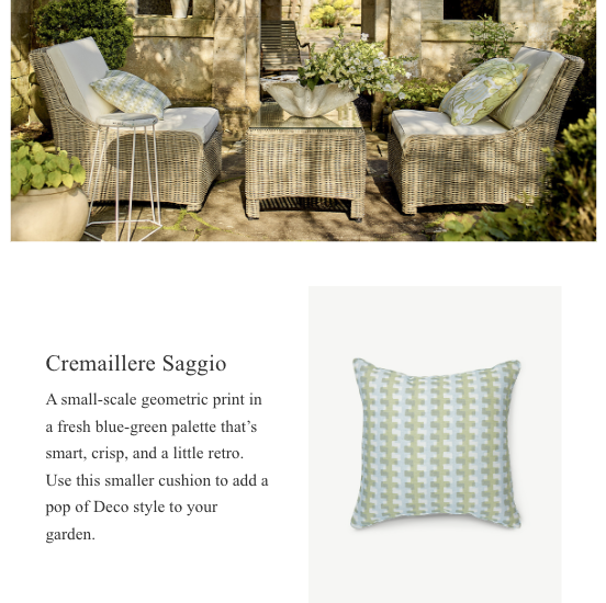
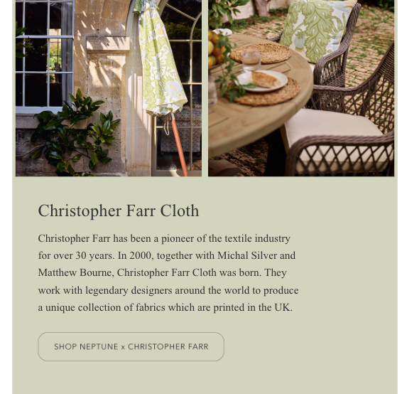
This email introduced our collaboration with Christopher Farr Cloth. Due to the very high price point of the collection, I included more copy than usual to make sure both the high performance nature of the products and the credibility of the brands involved was clear.
Social media
Paid
I undertook a major project to rewrite Neptune's paid media assets for Google, Facebook, and Pinterest.
These were outdated or had been automatically populated by the agency we worked with.
I came up with overlay text, headlines, introductory text and calls to action for numerous active campaigns as well as 'always on' assets, such as for the home and kitchen design services.
The main goals here were to ensure consistency in tone of voice throughout and to direct customers to our website landing pages.
Social media
Organic
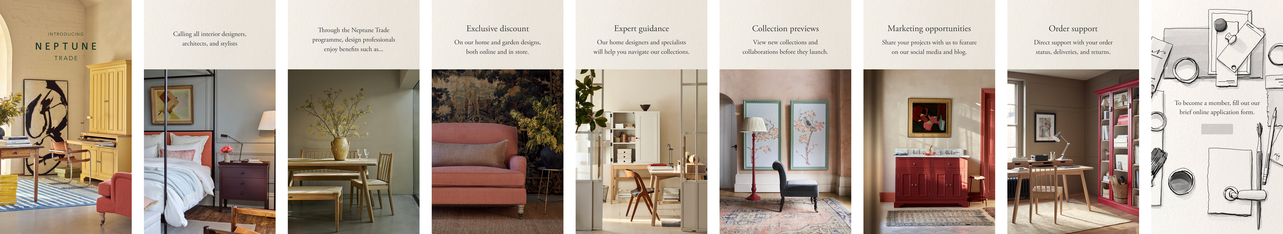
For the launch of the Neptune Trade programme, I worked with our digital designer to put together a series of Instagram stories. We needed it to feel like a new concept and to generate interest around it, while also relaying the key facts about the programme. We communicated closely to work out how we could achieve this through imagery and text without it feeling overwhelming.
Content writing
For print
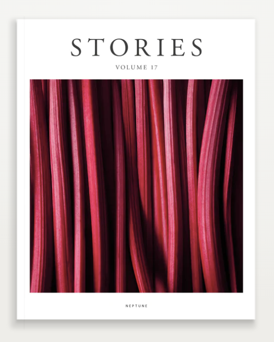
Two pieces I wrote for Neptune's latest edition of Stories magazine. I also sub-edited this volume, working with text supplied by leading journalists to ensure consistency with our style guide throughout.
Example 1: In each edition, we include a 'how-to' article that's a little bit unexpected. In this case, its a subtle reference to the nautical inspirations behind Neptune. It was really challenging to research the facts on this one and translate them into clear, easy-to-follow steps. I then worked with our designer to ensure the illustration and text matched up.
Example 2: The magazine is peppered with references to new season product to introduce a commercial angle. To drive excitement around the relaunch of our Ardingly cabinet, I emphasised its versatility and the fine quality design.

HOW TO:
Tie a reef knot

Many of us associate the reef knot with all things nautical.
After all, they are named after the practice of reefing, when a sail is furled and the excess cloth is bundled together and secured in place.
And yet, reef knots are used far more widely. You will find them securing curtains, all sorts of parcels, and medical bandages.
It’s also popular in jewellery-making and the primary knot
used in intricate macramé textiles.
An oft repeated mnemonic for remembering how to tie
a reef knot is ‘left over right, right over left.’ The reef knot
can also be used to join two pieces of rope, so long as they
are of equal lengths.
58
What you’ll need
A single length of rope.
What to do
1. Hold one end of the rope in your right hand
and one end in your left.
2. Pass the end of rope in your left hand over
the end in your right to form a loop.
3. Feed the same length of rope under and through the loop so the two are intertwined.
4. Form another loop with the loose ends.
This time, pass right over left.
5. Again, feed the same length of rope under and through the loop so the two are intertwined.
6. Pull on both ends until the knot is taut.
There you have it,
the humble reef knot.
59
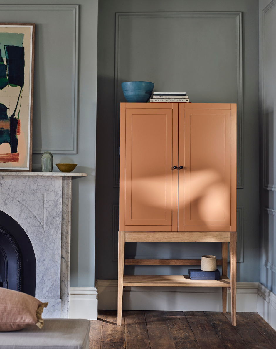

This is
ARDINGLY
Named after West Sussex’s famed antiques fair, this is storage that’s rooted in classic design. Behind Ardingly’s smart exterior, you’ll find dimmable lighting, adjustable shelves, and discreet cable management. Choose to include a mirrored back and a Carrara marble surface to create a luxurious dressing table or drinks cabinet. We’ve also imagined it as a coffee station,
a larder, or a home office piece.
How will you use Ardingly?
Ardingly cabinet with lower shelf in Burnt Sienna
Opposite:
37
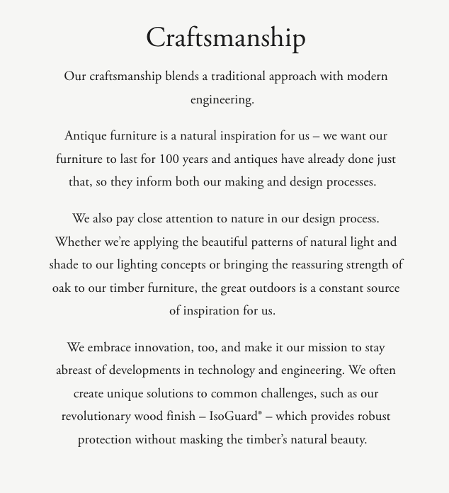
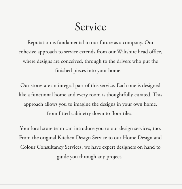
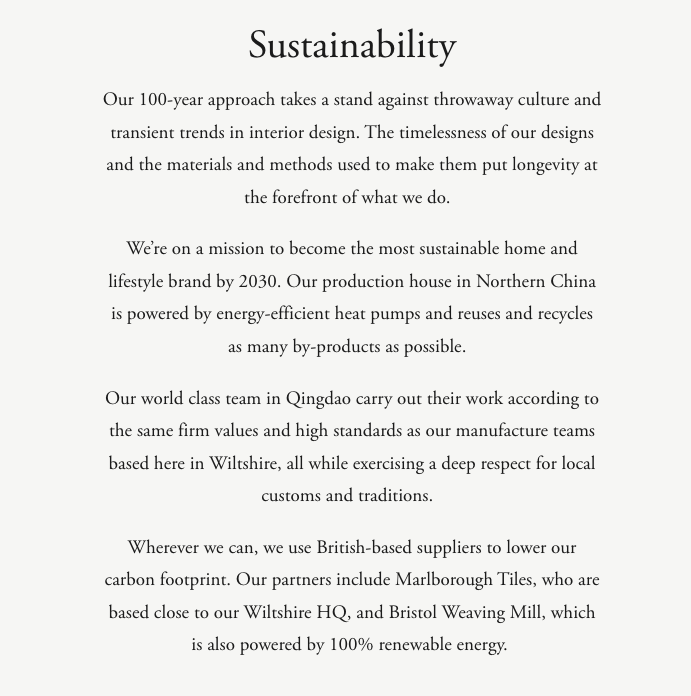
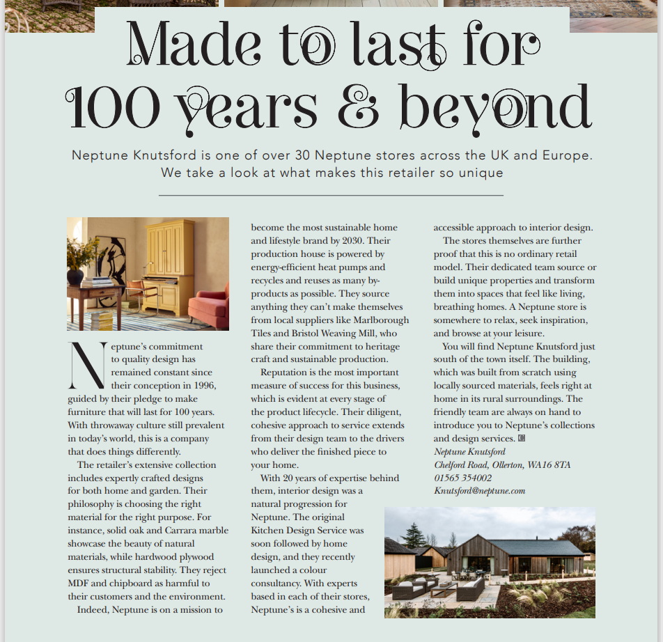
This was an advertorial for The Cheshire Magazine. The brief was to introduce readers to the brand and drive them into the Knutsford store. The headline reflects our 100-year brand mission, while the body copy covers our key pillars: materials, craftsmanship, sustainability, and service.
Content writing
For web
My role at Lorfords Antiques involved writing content pieces to include in weekly newsletters and boost the SEO profile of our website.
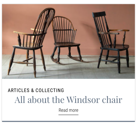
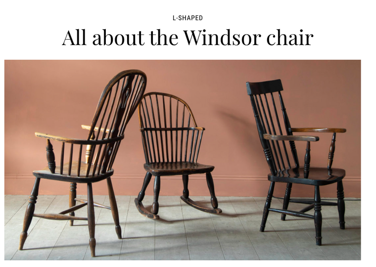
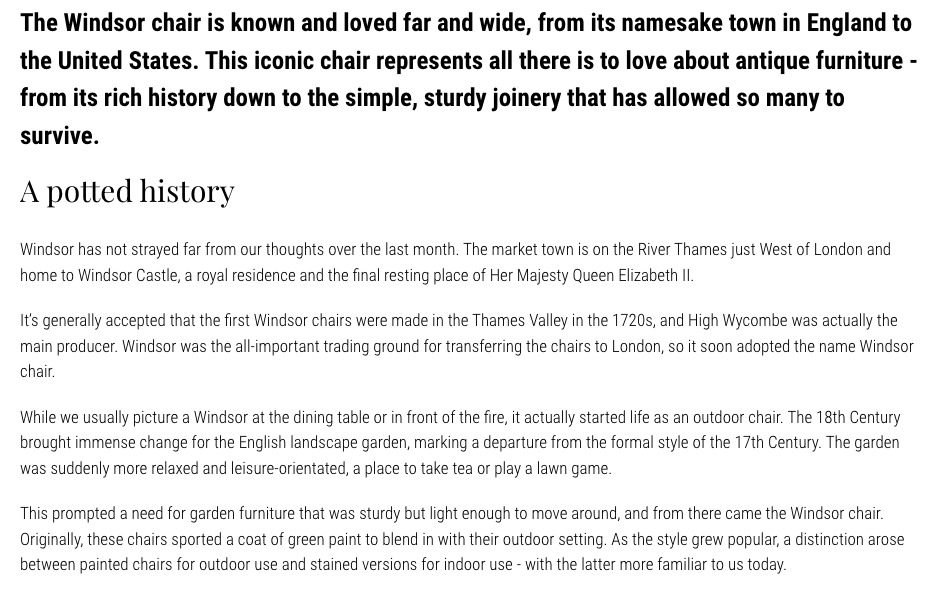
Example 1: This is an example of a 'knowledge piece,' that helped to build our authority and expertise as a brand. The subject matter was informed by keyword research.
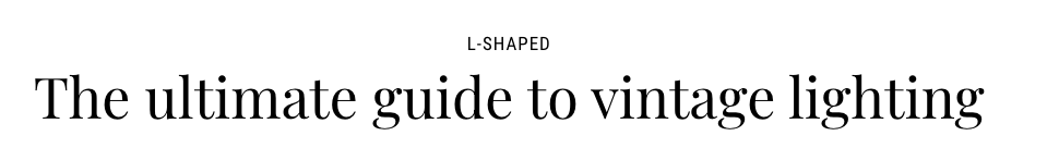
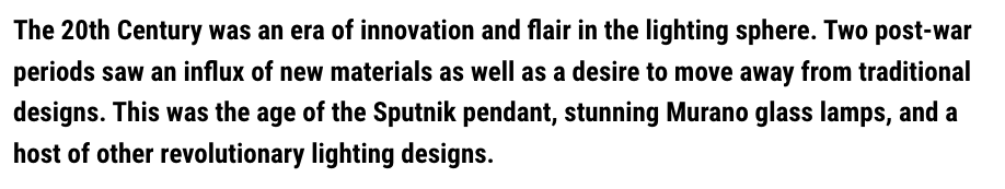
Example 2: A knowledge piece meets buying guide. Again, this was responding to high levels of search traffic for vintage lighting, and the number of designs that fit this description in our collection at the time. I researched key names in vintage lighting design and married this up with the designs we had available to form the structure of the piece.
Speculative
These projects were never briefed or commissioned. I've written and included them to demonstrate my skills outside of the industry I'm employed in.
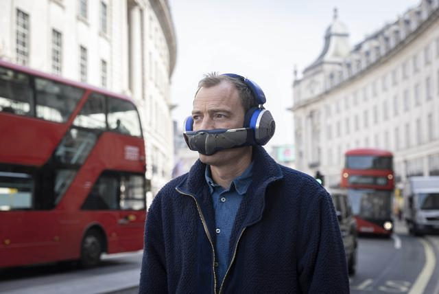
Launch of Dyson Zone ™
Print / digital advert concept
The launch of Dyson's air-purifying, noise-cancelling headphones caught my attention.
I converted their product information into a compelling advert, whilst maintaining their focus on tangible benefits.
In the copy, I've appealed to those who are sensitive to their external environment and looking to maintain a sense of calm.
Breathe deeper, listen closer, move more.
Protect your peace
with Dyson Zone™
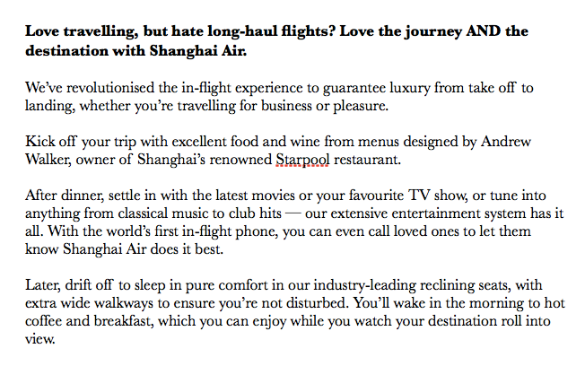
This is a fictional airline print advert I came across in a copywriting book. The book asks you to rewrite and improve the AD. You can find my rewrite below.

In rewriting this AD, I changed the perspective from talking about what we do to talking about how you'll benefit. I chose the chronological format to make it more experiential, rather than feeling like a list of benefits. Instead, the benefits are woven in more subtly. I've also built on the pioneering spirit of the brand that's hinted at in the first version and given this more personality, especially in the tongue-in-cheek line about calling loved ones.
Miscellany
I wrote this article back in 2020 during the depths of lockdown. At a time when my future employment felt very uncertain, it was a great feeling when my pitch was accepted by The Independent. Link to full article here.